

More insights.

Subscribe to our newsletter.
Deep dives into design thinking, creative process, and the intersection of business and aesthetics.
The Difference Between Branding and Visual Identity
Most businesses begin thinking about their brand when they need something designed.
A logo.
A website.
A color palette.
A set of social media templates.
A presentation deck that finally looks as established as the company believes it has become.
That is usually the moment branding enters the conversation. The business has grown past whatever was created at the beginning, the old materials no longer reflect the level of the work, and the company is ready to look more polished.
The instinct makes sense.
What people see matters.
The problem begins when appearance becomes the entire definition of the brand.
Visual identity is one part of branding, but it is not the brand itself. It gives the business a recognizable face. It does not decide what the business stands for, how it is positioned, what it promises, or why someone should choose it.
A company can have a sophisticated identity and still be strategically weak. It can look premium while competing on price. It can appear modern while operating with an outdated customer experience. It can invest heavily in design while remaining impossible to explain in a single sentence.
That is the difference businesses often miss.
Visual identity controls recognition.
Branding controls meaning.
When those two are aligned, the company becomes easier to understand, remember, and trust. When they are disconnected, the business may look finished while the brand underneath it remains unresolved.
Why the Confusion Exists
Visual identity is easier to see than strategy.
A business can compare an old logo to a new one. It can review typography, colors, photography, and page layouts. It can approve a design direction, request revisions, and leave the process with files that feel complete.
Brand strategy is less visible.
It requires decisions about position, audience, value, differentiation, language, customer expectations, and long-term direction. Those decisions are harder because they force the business to define what it is willing to stand for and what it is willing to leave behind.
A company can approve a color in ten minutes.
It may take months to decide what it wants to own in the market.
That difference is one reason visual identity frequently replaces the larger branding conversation. Design creates momentum. Strategy creates tension. Design gives people something to react to. Strategy exposes where leadership, sales, marketing, and operations are not aligned.
The result is predictable.
The business moves forward with the visible work because it feels productive. The logo improves. The website becomes cleaner. The social presence looks more consistent. Everyone agrees the company finally appears professional.
Then the same problems return.
Customers still do not understand the offer.
Sales still explains the company differently depending on who is speaking.
The website still tries to serve too many audiences.
The content still shifts tone every week.
The company still struggles to explain why it is different without listing features, years of experience, or vague claims about quality.
The identity changed.
The meaning did not.
What Visual Identity Actually Does
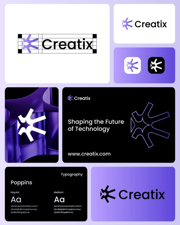
Visual identity is the designed expression of the brand.
It includes the logo, typography, color system, photography, graphic elements, layout rules, iconography, motion, and the visual choices that help people recognize the company across different environments.
Its purpose is not decoration.
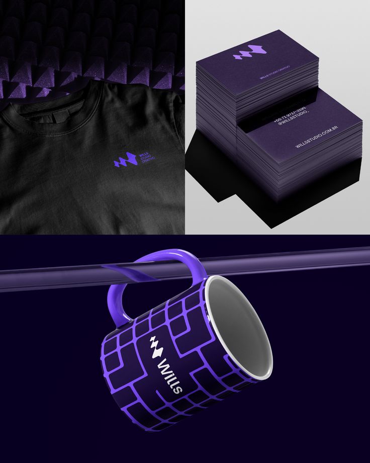
A strong identity creates consistency. It helps the business appear connected across its website, social channels, documents, packaging, presentations, physical spaces, and customer communications.
It can signal qualities before a person reads a word.
A restrained identity may communicate control and precision. A louder system may communicate energy and disruption. A highly editorial approach may create authority. A warmer visual direction may make the company feel more accessible.
These signals matter because people form impressions quickly.
They use visual information to estimate quality, relevance, familiarity, and risk. Before they understand the company, they are already deciding what kind of company it appears to be.
That gives visual identity real business value.
It can make a new company feel more credible. It can help an established company appear more current. It can unify teams, improve recognition, and give marketing a system that works across channels.
But visual identity cannot decide what the company means.
It can only express the meaning that has already been defined.
What Branding Actually Does
Branding is the larger system that shapes how a business is understood.
It includes the company’s position, promise, reputation, values, language, behavior, customer experience, market role, and the expectations created every time someone encounters it.
Branding answers questions visual identity cannot answer on its own.
What is this business known for?
Who is it for?
Why does it matter?
What does it believe that competitors do not?
What should customers expect?
What makes the company easier to choose?
What makes it difficult to replace?
Those answers influence far more than design.
They affect what services are offered, how products are structured, how sales conversations are handled, how customers are treated, how content is written, how partnerships are evaluated, and how the business responds when pressure exposes the gap between what it says and what it actually does.
A brand is not just the story a company tells.
It is the pattern people recognize.
That pattern is built through repetition. Every decision either strengthens it or weakens it.
The website makes a promise.
The sales process sets an expectation.
The service experience either confirms it or breaks it.
The customer remembers the result.
That memory becomes reputation.
Branding lives across that entire chain.
The Problem With Starting at the Surface
There is nothing wrong with beginning a project because the logo or website needs to change.
The risk is treating the visible problem as the whole problem.
A business may believe the identity feels dated when the deeper issue is that the market position is no longer clear. It may believe the website needs better design when the actual offer has become too complicated. It may believe the brand needs more energy when customers are struggling to understand what the company does.
If the deeper issue is not identified, the design process becomes an exercise in styling uncertainty.
The new identity may look better, but the business is still asking it to communicate too many things at once.
This often produces brands that are visually impressive but strategically interchangeable.
The typography is modern.
The photography is polished.
The website moves beautifully.
The copy still sounds like everyone else.
The business still uses the same claims: trusted, innovative, tailored, results-driven, customer-focused, built differently.
Nothing is technically wrong.
Nothing is memorable either.
A visual system cannot create distinction when the company has not decided what makes it distinct.
Where Visual Identity Works
Visual identity is powerful when the business has already made the harder decisions.
When the position is clear, design gives it form.
When the audience is understood, design helps the business signal relevance.
When the promise is credible, design helps people recognize it faster.
When the customer experience is consistent, design connects separate moments into one recognizable system.
This is why certain brands feel complete.
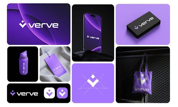
Their visual choices do not exist independently. The design reinforces the language. The language supports the offer. The offer reflects the position. The experience proves the promise.
Nothing feels added for effect.
Every element appears to belong.
The visual identity becomes valuable because it is carrying a clear idea.
It does not have to explain everything. It only has to make the underlying strategy easier to recognize.
Where It Fails
Visual identity fails when it is asked to perform the work of strategy.
A premium identity cannot justify premium pricing if the experience feels ordinary. A bold identity cannot make a cautious company feel disruptive. A friendly visual system cannot compensate for a difficult customer journey. A modern website cannot hide an offer built around outdated assumptions.
Eventually, reality catches up with presentation.
Customers notice when the promise and experience do not match. Employees notice when the brand language does not reflect how the company operates. Sales teams abandon the approved messaging when it does not help them explain the value. Marketing keeps creating new campaigns because the central position is not strong enough to carry across the business.
The identity may remain consistent while the brand becomes increasingly fragmented.
That is the limitation of visual work without structural alignment.
It can create recognition.
It cannot sustain belief.
A Logo Is Not a Position
Many companies place too much pressure on the logo.
They want it to communicate trust, innovation, scale, warmth, intelligence, authority, flexibility, and the founder’s personal story, all within one mark.
A logo cannot carry that much meaning by itself.
Most logos gain meaning after the business becomes known, not before.
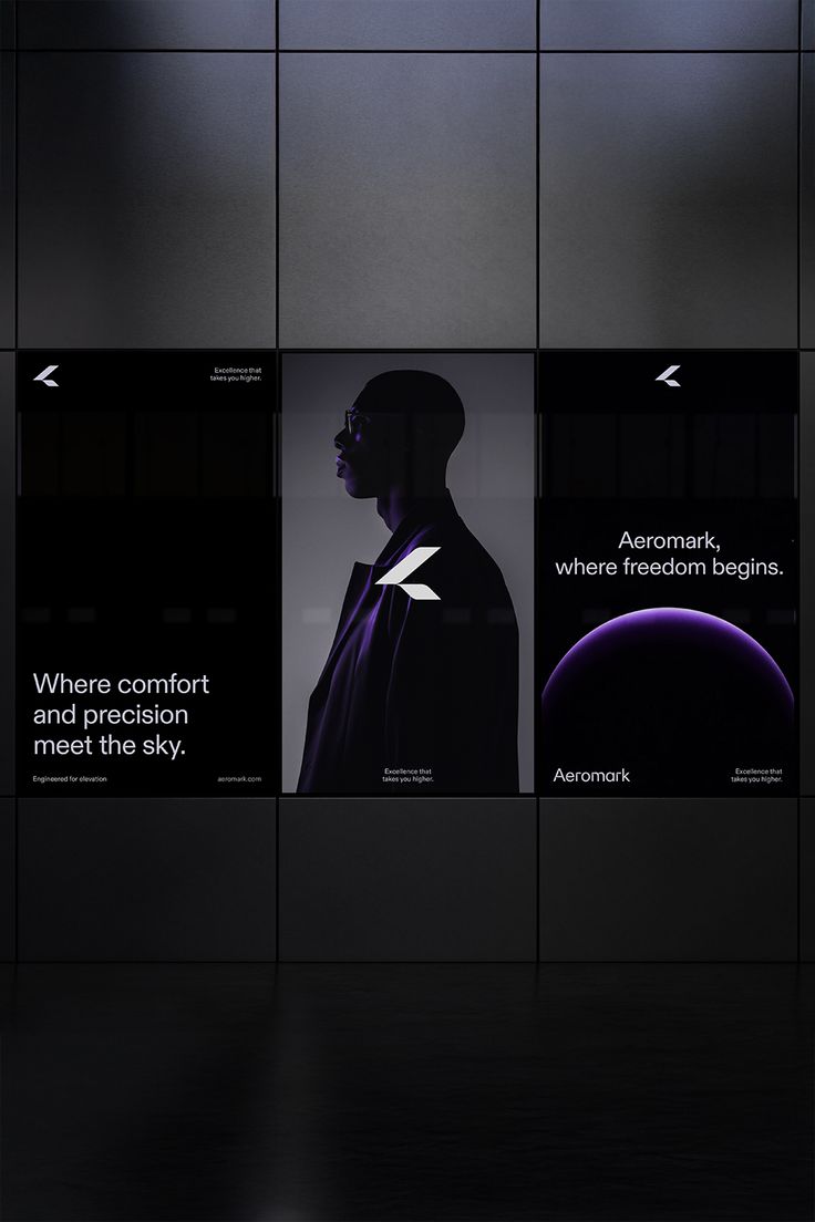
The symbol becomes valuable because people associate it with an experience, a product, a standard, or a reputation. The business builds the meaning. The logo stores it.
This is why simple marks can become powerful and complex marks can remain forgettable.
The difference is rarely hidden inside the shape.
It comes from what the company consistently attached to it.
A strong logo supports recognition. A strong brand gives people something worth recognizing.
The Brand Must Work Without the Design
One of the best ways to test a brand is to temporarily remove the visuals.
Take away the logo.
Remove the colors.
Ignore the photography.
Read the message in plain text.
Does the business still sound distinct?
Can someone understand the position?
Is the value clear?
Does the language reflect a real point of view?
Would the promise still mean something if it appeared in a basic document with no design at all?
If the answer is no, the visual identity may be doing too much of the work.
That does not make the design weak.
It means the strategy underneath it has not been developed enough to stand on its own.
The strongest brands remain recognizable even when the visual system is reduced. Their language, behavior, offer, and perspective carry enough consistency that people still know who is speaking.
Design makes that recognition faster.
It should not be the only thing making recognition possible.
What Strong Brands Do Differently
Strong brands separate the strategic decisions from the visual decisions, then bring them back together deliberately.
They first define what the business wants to own.
They decide what problem matters most, what audience the company is built to serve, what promise it can repeatedly keep, and what position gives the business a reason to exist beyond offering another version of what already exists.
They clarify the language.
They determine what the company will say, what it will stop saying, and what customers should understand after every interaction.
They examine the experience.
They ask whether the sales process, onboarding, service delivery, product, support, and follow-up all reinforce the same expectation.
Only then does the visual identity have a stable foundation.
The colors are chosen because they support the position.
The typography reflects the personality and role of the brand.
The photography helps people recognize themselves, the outcome, or the world the company is building.
The website hierarchy guides the decision instead of simply displaying information.
The system becomes more than attractive.
It becomes useful.
Branding Is an Operating Decision
One of the biggest mistakes businesses make is placing branding entirely inside marketing.
Marketing communicates the brand, but it does not control every part of it.
Operations shapes the customer experience.
Leadership shapes the direction.
Sales shapes expectations.
Product shapes value.
Customer service shapes reputation.
Hiring shapes culture.
Every department contributes to what the brand becomes.
That means branding cannot remain a campaign-level concern. It has to function as an operating decision.
When the company launches a new service, the brand should help determine whether that service fits.
When leadership enters a partnership, the brand should help evaluate whether the association strengthens or weakens the position.
When sales creates a new promise, the brand should determine whether the organization can consistently deliver it.
When marketing develops a campaign, the brand should ensure the message builds long-term meaning instead of chasing short-term attention.
Visual identity supports all of this by making the company recognizable.
Branding gives the company a standard to operate against.
Better Questions Before a Rebrand
Before changing the visual identity, businesses should ask what they are actually trying to fix.
Is the brand difficult to recognize, or is the business difficult to understand?
Does the company look outdated, or has the position become outdated?
Are customers confused by the design, or are they confused by the offer?
Is the current identity limiting growth, or is the business expecting design to solve a growth problem created somewhere else?
Does the company need a new appearance, or does it need a clearer decision about what it wants to become?
These questions do not eliminate the need for design.
They make the design more accurate.
A rebrand is most valuable when it marks a real strategic shift, not when it gives the same uncertainty a more polished surface.
The Brand Room Perspective
Visual identity is not superficial.
It is simply not sufficient.
It influences first impressions, recognition, credibility, and consistency. It can change how a company is perceived and how confidently it enters the market. It deserves serious thought and strong execution.
But the identity can only express what the business has already defined.
When strategy is weak, design becomes responsible for creating meaning. When strategy is clear, design becomes responsible for making meaning visible.
That distinction changes the entire process.
The question is no longer, “How should this brand look?”
The better question is, “What must this business mean before anyone sees it?”
The Honor Mark™
A business does not become a brand because the design is finished.
It becomes a brand when people consistently understand what it stands for, what they can expect from it, and why it matters in a market full of alternatives.
The logo may be the first thing they recognize.
The meaning is what they remember.
________________________________________
Original editorial analysis from The Brand Room™ by Branded with Honor.
© 2026 Branded with Honor LLC. All rights reserved. This work may not be copied, adapted, republished, distributed, or presented as original work without written permission.
The Difference Between Branding and Visual Identity
Most businesses begin thinking about their brand when they need something designed.
A logo.
A website.
A color palette.
A set of social media templates.
A presentation deck that finally looks as established as the company believes it has become.
That is usually the moment branding enters the conversation. The business has grown past whatever was created at the beginning, the old materials no longer reflect the level of the work, and the company is ready to look more polished.
The instinct makes sense.
What people see matters.
The problem begins when appearance becomes the entire definition of the brand.
Visual identity is one part of branding, but it is not the brand itself. It gives the business a recognizable face. It does not decide what the business stands for, how it is positioned, what it promises, or why someone should choose it.
A company can have a sophisticated identity and still be strategically weak. It can look premium while competing on price. It can appear modern while operating with an outdated customer experience. It can invest heavily in design while remaining impossible to explain in a single sentence.
That is the difference businesses often miss.
Visual identity controls recognition.
Branding controls meaning.
When those two are aligned, the company becomes easier to understand, remember, and trust. When they are disconnected, the business may look finished while the brand underneath it remains unresolved.
Why the Confusion Exists
Visual identity is easier to see than strategy.
A business can compare an old logo to a new one. It can review typography, colors, photography, and page layouts. It can approve a design direction, request revisions, and leave the process with files that feel complete.
Brand strategy is less visible.
It requires decisions about position, audience, value, differentiation, language, customer expectations, and long-term direction. Those decisions are harder because they force the business to define what it is willing to stand for and what it is willing to leave behind.
A company can approve a color in ten minutes.
It may take months to decide what it wants to own in the market.
That difference is one reason visual identity frequently replaces the larger branding conversation. Design creates momentum. Strategy creates tension. Design gives people something to react to. Strategy exposes where leadership, sales, marketing, and operations are not aligned.
The result is predictable.
The business moves forward with the visible work because it feels productive. The logo improves. The website becomes cleaner. The social presence looks more consistent. Everyone agrees the company finally appears professional.
Then the same problems return.
Customers still do not understand the offer.
Sales still explains the company differently depending on who is speaking.
The website still tries to serve too many audiences.
The content still shifts tone every week.
The company still struggles to explain why it is different without listing features, years of experience, or vague claims about quality.
The identity changed.
The meaning did not.
What Visual Identity Actually Does
Visual identity is the designed expression of the brand.
It includes the logo, typography, color system, photography, graphic elements, layout rules, iconography, motion, and the visual choices that help people recognize the company across different environments.
Its purpose is not decoration.
A strong identity creates consistency. It helps the business appear connected across its website, social channels, documents, packaging, presentations, physical spaces, and customer communications.
It can signal qualities before a person reads a word.
A restrained identity may communicate control and precision. A louder system may communicate energy and disruption. A highly editorial approach may create authority. A warmer visual direction may make the company feel more accessible.
These signals matter because people form impressions quickly.
They use visual information to estimate quality, relevance, familiarity, and risk. Before they understand the company, they are already deciding what kind of company it appears to be.
That gives visual identity real business value.
It can make a new company feel more credible. It can help an established company appear more current. It can unify teams, improve recognition, and give marketing a system that works across channels.
But visual identity cannot decide what the company means.
It can only express the meaning that has already been defined.
What Branding Actually Does
Branding is the larger system that shapes how a business is understood.
It includes the company’s position, promise, reputation, values, language, behavior, customer experience, market role, and the expectations created every time someone encounters it.
Branding answers questions visual identity cannot answer on its own.
What is this business known for?
Who is it for?
Why does it matter?
What does it believe that competitors do not?
What should customers expect?
What makes the company easier to choose?
What makes it difficult to replace?
Those answers influence far more than design.
They affect what services are offered, how products are structured, how sales conversations are handled, how customers are treated, how content is written, how partnerships are evaluated, and how the business responds when pressure exposes the gap between what it says and what it actually does.
A brand is not just the story a company tells.
It is the pattern people recognize.
That pattern is built through repetition. Every decision either strengthens it or weakens it.
The website makes a promise.
The sales process sets an expectation.
The service experience either confirms it or breaks it.
The customer remembers the result.
That memory becomes reputation.
Branding lives across that entire chain.
The Problem With Starting at the Surface
There is nothing wrong with beginning a project because the logo or website needs to change.
The risk is treating the visible problem as the whole problem.
A business may believe the identity feels dated when the deeper issue is that the market position is no longer clear. It may believe the website needs better design when the actual offer has become too complicated. It may believe the brand needs more energy when customers are struggling to understand what the company does.
If the deeper issue is not identified, the design process becomes an exercise in styling uncertainty.
The new identity may look better, but the business is still asking it to communicate too many things at once.
This often produces brands that are visually impressive but strategically interchangeable.
The typography is modern.
The photography is polished.
The website moves beautifully.
The copy still sounds like everyone else.
The business still uses the same claims: trusted, innovative, tailored, results-driven, customer-focused, built differently.
Nothing is technically wrong.
Nothing is memorable either.
A visual system cannot create distinction when the company has not decided what makes it distinct.
Where Visual Identity Works
Visual identity is powerful when the business has already made the harder decisions.
When the position is clear, design gives it form.
When the audience is understood, design helps the business signal relevance.
When the promise is credible, design helps people recognize it faster.
When the customer experience is consistent, design connects separate moments into one recognizable system.
This is why certain brands feel complete.
Their visual choices do not exist independently. The design reinforces the language. The language supports the offer. The offer reflects the position. The experience proves the promise.
Nothing feels added for effect.
Every element appears to belong.
The visual identity becomes valuable because it is carrying a clear idea.
It does not have to explain everything. It only has to make the underlying strategy easier to recognize.
Where It Fails
Visual identity fails when it is asked to perform the work of strategy.
A premium identity cannot justify premium pricing if the experience feels ordinary. A bold identity cannot make a cautious company feel disruptive. A friendly visual system cannot compensate for a difficult customer journey. A modern website cannot hide an offer built around outdated assumptions.
Eventually, reality catches up with presentation.
Customers notice when the promise and experience do not match. Employees notice when the brand language does not reflect how the company operates. Sales teams abandon the approved messaging when it does not help them explain the value. Marketing keeps creating new campaigns because the central position is not strong enough to carry across the business.
The identity may remain consistent while the brand becomes increasingly fragmented.
That is the limitation of visual work without structural alignment.
It can create recognition.
It cannot sustain belief.
A Logo Is Not a Position
Many companies place too much pressure on the logo.
They want it to communicate trust, innovation, scale, warmth, intelligence, authority, flexibility, and the founder’s personal story, all within one mark.
A logo cannot carry that much meaning by itself.
Most logos gain meaning after the business becomes known, not before.
The symbol becomes valuable because people associate it with an experience, a product, a standard, or a reputation. The business builds the meaning. The logo stores it.
This is why simple marks can become powerful and complex marks can remain forgettable.
The difference is rarely hidden inside the shape.
It comes from what the company consistently attached to it.
A strong logo supports recognition. A strong brand gives people something worth recognizing.
The Brand Must Work Without the Design
One of the best ways to test a brand is to temporarily remove the visuals.
Take away the logo.
Remove the colors.
Ignore the photography.
Read the message in plain text.
Does the business still sound distinct?
Can someone understand the position?
Is the value clear?
Does the language reflect a real point of view?
Would the promise still mean something if it appeared in a basic document with no design at all?
If the answer is no, the visual identity may be doing too much of the work.
That does not make the design weak.
It means the strategy underneath it has not been developed enough to stand on its own.
The strongest brands remain recognizable even when the visual system is reduced. Their language, behavior, offer, and perspective carry enough consistency that people still know who is speaking.
Design makes that recognition faster.
It should not be the only thing making recognition possible.
What Strong Brands Do Differently
Strong brands separate the strategic decisions from the visual decisions, then bring them back together deliberately.
They first define what the business wants to own.
They decide what problem matters most, what audience the company is built to serve, what promise it can repeatedly keep, and what position gives the business a reason to exist beyond offering another version of what already exists.
They clarify the language.
They determine what the company will say, what it will stop saying, and what customers should understand after every interaction.
They examine the experience.
They ask whether the sales process, onboarding, service delivery, product, support, and follow-up all reinforce the same expectation.
Only then does the visual identity have a stable foundation.
The colors are chosen because they support the position.
The typography reflects the personality and role of the brand.
The photography helps people recognize themselves, the outcome, or the world the company is building.
The website hierarchy guides the decision instead of simply displaying information.
The system becomes more than attractive.
It becomes useful.
Branding Is an Operating Decision
One of the biggest mistakes businesses make is placing branding entirely inside marketing.
Marketing communicates the brand, but it does not control every part of it.
Operations shapes the customer experience.
Leadership shapes the direction.
Sales shapes expectations.
Product shapes value.
Customer service shapes reputation.
Hiring shapes culture.
Every department contributes to what the brand becomes.
That means branding cannot remain a campaign-level concern. It has to function as an operating decision.
When the company launches a new service, the brand should help determine whether that service fits.
When leadership enters a partnership, the brand should help evaluate whether the association strengthens or weakens the position.
When sales creates a new promise, the brand should determine whether the organization can consistently deliver it.
When marketing develops a campaign, the brand should ensure the message builds long-term meaning instead of chasing short-term attention.
Visual identity supports all of this by making the company recognizable.
Branding gives the company a standard to operate against.
Better Questions Before a Rebrand
Before changing the visual identity, businesses should ask what they are actually trying to fix.
Is the brand difficult to recognize, or is the business difficult to understand?
Does the company look outdated, or has the position become outdated?
Are customers confused by the design, or are they confused by the offer?
Is the current identity limiting growth, or is the business expecting design to solve a growth problem created somewhere else?
Does the company need a new appearance, or does it need a clearer decision about what it wants to become?
These questions do not eliminate the need for design.
They make the design more accurate.
A rebrand is most valuable when it marks a real strategic shift, not when it gives the same uncertainty a more polished surface.
The Brand Room Perspective
Visual identity is not superficial.
It is simply not sufficient.
It influences first impressions, recognition, credibility, and consistency. It can change how a company is perceived and how confidently it enters the market. It deserves serious thought and strong execution.
But the identity can only express what the business has already defined.
When strategy is weak, design becomes responsible for creating meaning. When strategy is clear, design becomes responsible for making meaning visible.
That distinction changes the entire process.
The question is no longer, “How should this brand look?”
The better question is, “What must this business mean before anyone sees it?”
The Honor Mark™
A business does not become a brand because the design is finished.
It becomes a brand when people consistently understand what it stands for, what they can expect from it, and why it matters in a market full of alternatives.
The logo may be the first thing they recognize.
The meaning is what they remember.
________________________________________
Original editorial analysis from The Brand Room™ by Branded with Honor.
© 2026 Branded with Honor LLC. All rights reserved. This work may not be copied, adapted, republished, distributed, or presented as original work without written permission.